Have you ever wondered whether colours and meanings are influential when applying for a job. Well, there is such a thing as colour psychology, and it’s proven that colours can project certain feelings or even induce different emotions.
By taking advantage of this and building a CV with the right colours for your position you can make your application more appealing to a hiring manager.
So, what kinds of colours should you use for your CV and are there any colours that you should avoid when designing a CV?
Read up on colours and how they can relate to your line of work so that you can make the best CV for the next position you apply to!
Colours and meanings
It has been said many times that colours have certain abilities in creating and influencing moods as well as representing emotions, feelings, and energies.
So what kind of colours match your job application? Read our list of colours and meanings.
- Red: The colour red is used as many companies’ colours and can regularly symbolise motivation and determination.
- Orange: Warm, yet said to inflict anger, orange can be perceived to emit force, productivity, determination, and strength.
- Blue: Hand in hand with its partner pink, blue is a colour typically used for masculinity, although nowadays, it is a much more neutral colour. Many companies use blue as a company colour, so it is also a pretty safe choice. as It can project a feel of professionalism, particularly navy blue.
- Green: Optimism, balance, environment, and nature seem to be the typical energies of the colour green. Green is also the colour symbol for eco-friendly campaigns, companies, and products.
- Yellow: It’s not common to see yellow on a CV, given that it is a particularly bright colour. Although it is said to emit feelings of happiness, creativity and joy.
- Brown: Some refer to the colour brown as a boring colour and others think of brown as a practical, orderly and neutral colour. stability.
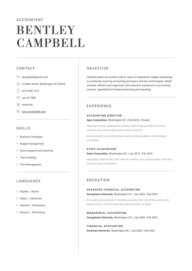
- Grey: A neutral colour and often a favourite for CV colours and design. Grey is a classic colour and is also used to portray elegance, professionalism, and modesty. The ideal characteristic of the colour grey is that it’s timeless.
- Black (and white): Black and white are classic colours and are used consistently in all paperwork, meaning that it is natural to have a CV in simple black font and nothing else. If you are doubtful about using colours, you can’t go wrong using a simple black and white CV format.
- Gold: Royal, luxurious and divine, gold is a prestigious colour. It’s not used as a CV colour frequently. However,not much can escape the rise of creative CVs, so if you’re a designer or work in the art industry, it may be a colour to consider.
- Silver: Not as prestigious as gold but equally exuberant, silver is not used as a colour on traditional or standard CVs.
It’s essential to choose the correct design or your CV may look completely out of place. If you use a CV colour template you’ll have an easier task of selecting the best choice for your field.
Best colours for CV
Colour choice depends on different factors. It’s not simply personal taste, the type of job and the company to which you are applying.
The best colours for a CV are usually:
- Neutral colours
- Darker shades of blue
- Purple
That said, there’s nothing wrong with using a lighter shade if that’s what you feel will work for your job application. In fact, pastel shades are also common to see on a CV.
Pastel colours are a calm CV design approach that might seem less aggressive. This could be particularly beneficial to those who are applying for a job where playful, supportive or attentive characteristics are required. For example, it can be ideal for nannies or teachers.
Using the company’s colours can create a connection between the candidate and recruiter, as well.
For example, if you know that the company’s colour is red, add a touch of red to your CV. This can be indirectly appealing to the recruiter before they’ve even read your professional profile.
Dos and dont’s of CV colours
A well-designed CV with appropriate colour schemes can enhance readability and leave a lasting impression. However, improper colour choices may have the opposite effect, undermining your credibility and causing your CV to be overlooked.
To ensure your CV leaves the right impression, follow these dos and don’ts of CV colours:
Do’s:
- Stick to a maximum of two complementary colours in addition to black and white. This will keep your CV looking professional and well-organised.
- Choose colours that evoke positive emotions and represent your brand.
- Use colours sparingly to highlight specific areas, such as section headings or your name.
- Keep your chosen colours consistent throughout your CV.
- Test your CV on various devices and screens to ensure that the colours appear correctly and maintain their intended impact across different platforms.
Don’ts:
- Avoid overly bright or neon colours, as they can be harsh on the eyes.
- Steer clear of colours that may be difficult to read against your chosen background. For example, yellow text on a white background is likely to strain the reader’s eyes.
- Refrain from using too many colours, as this can result in a cluttered and unprofessional appearance.
- Don’t rely solely on colour to convey important information. Remember that some readers may be colour-blind or may print your CV in black and white.
Trying not to be too flashy will help ensure the colours you select will keep your CV organised and appealing. By using these strategies you can find the ideal combination of colours to showcase your unique attributes and make a lasting impression on potential employers.
Related Posts


